16 Useful Responsive CSS Frameworks And Boilerplates
In this collection, we are showcasing 16 most useful and responsive CSS frameworks that will help the developers to create responsive websites. In this day and age, responsive web designs are getting popular day by day because they are interactive and look good as well. Furthermore, as developers now have more tools and resources, thus creating responsive website designs is no more a difficult task.
Here, we have put together 16 most useful responsive CSS frameworks for you to help you do your job effectively. Enjoy looking into this collection and have more fun using them in your work. Remember that your comments are always more than welcome.
Sleek, intuitive, and powerful front-end framework for faster and easier web development.

Create rapid and logical page layout and app prototypes with Gumby Framework, a responsive CSS framework based on the 960 grid you already know.

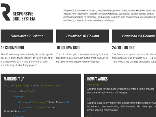
This is the Responsive Grid System, a quick, easy and flexible way to create a responsive web site.

Less+ Framework is a cross-device CSS grid system using media queries.

Simple CSS framework for fast, intuitive development of responsive websites. Built using the ‘Mobile First’ approach, ‘clearfix’ for clearing floats, box-sizing: border-box for adding additional padding to elements, and weighs less then 1kb compressed. Responsive design isn’t hard, you’ve just never used responsive.gs.
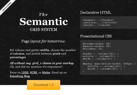
Set column and gutter widths, choose the number of columns, and switch between pixels and percentages. All without any .grid_x classes in your markup. Oh, and did we mention it’s responsive?
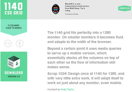
The 1140 grid fits perfectly into a 1280 monitor. On smaller monitors it becomes fluid and adapts to the width of the browser.
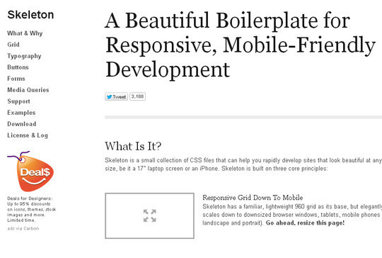
Skeleton is a small collection of CSS files that can help you rapidly develop sites that look beautiful at any size, be it a 17″ laptop screen or an iPhone. Skeleton is built on three core principles:
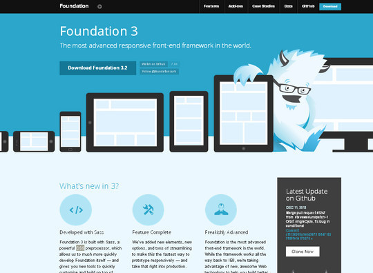
The most advanced responsive front-end framework in the world.
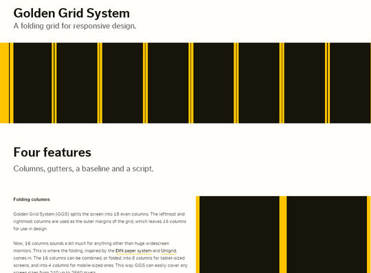
Golden Grid System (GGS) splits the screen into 18 even columns. The leftmost and rightmost columns are used as the outer margins of the grid, which leaves 16 columns for use in design.
A CSS framework for responsive web designs.

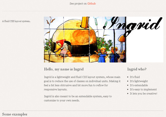
Ingrid is a lightweight and fluid CSS layout system, whose main goal is to reduce the use of classes on individual units. Making it feel a bit less obtrusive and bit more fun to reflow for responsive layouts.
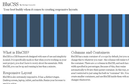
BluCSS is also extremely responsive. It has 4 distinct stages. Desktop screen, laptop, tablet, and mobile. Resize your browser to see it in action.
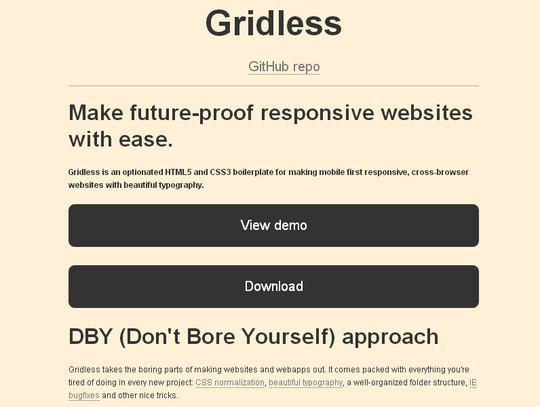
Gridless is an optionated HTML5 and CSS3 boilerplate for making mobile first responsive, cross-browser websites with beautiful typography.
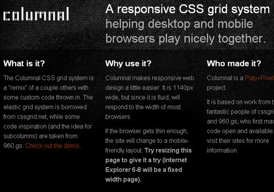
A responsive CSS grid system helping desktop and mobile browsers play nicely together.
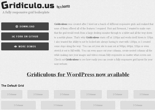
Gridiculous is an HTML5 responsive grid boilerplate that can take your site from 1200px all the way down to 320px. Make you site look great on desktop browsers, tablets and handheld devices.
via Free and Useful Online Resources for Designers and Developers http://feedproxy.google.com/~r/SmashingApps/~3/aZcQCoY4ezU/16-useful-responsive-css-frameworks-and-boilerplates.html