45+ Handy Responsive Web Design Toolbox
Here, we are showcasing a list of 45+ best responsive web design toolboxes for you so that you can add them to your toolbox. With these responsive web design toolboxes, you can easily create responsive website designs. as we all know that with the increase in the use of smartphones, Android phones, iPhones and tablets more and more users are accessing their favorite websites right from their devices. To cater all those visitors who are accessing the website from mobile devices, it is necessary that you choose to create a responsive website design.
With the help of these responsive web design toolboxes, web designers and developers can easily design responsive websites and can earn intensely. Here is the complete list for you. Enjoy!
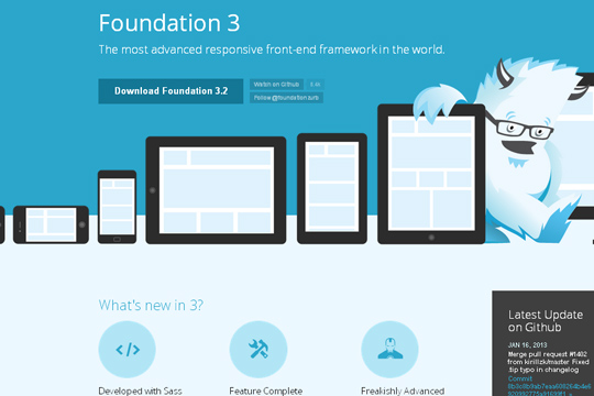
The most advanced responsive front-end framework in the world.
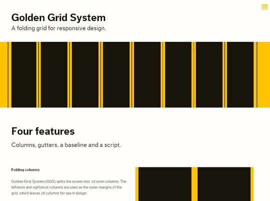
A grid system for responsive web design. Includes folding columns, elastic gutters, a zoomable baseline grid, and a delightful grid overlay script.
SG is prepared for 4 distinct ranges of screen size: screens 720px, screens > than 985px, and screens > than 1235px. So people visiting your site will receive a layout that’s tuned to the size of their browser window. Say goodbye to horizontal scrollbars.

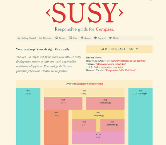
Susy is based on Natalie Downe’s CSS Systems, made possible by Sass, and made easy with Compass. You can use it anywhere, from static sites to Django, Rails, WordPress and more. It even comes packaged as part of Middleman, to make your life easy.
Set column and gutter widths, choose the number of columns, and switch between pixels and percentages. All without any .grid_x classes in your markup. Oh, and did we mention it’s responsive?

Rapid Prototyping of Fluid Layouts, Adaptive CSS and Responsive Design

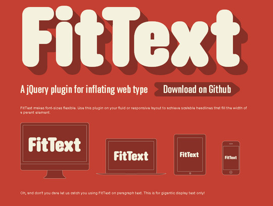
A jQuery plugin for radical web typography.

FitText makes font-sizes flexible. Use this plugin on your fluid or responsive layout to achieve scalable headlines that fill the width of a parent element.
The Responsive grid generator Creating a Responsive grid system just became a total breeze.

The happy & awesome way to build fluid grid based websites.

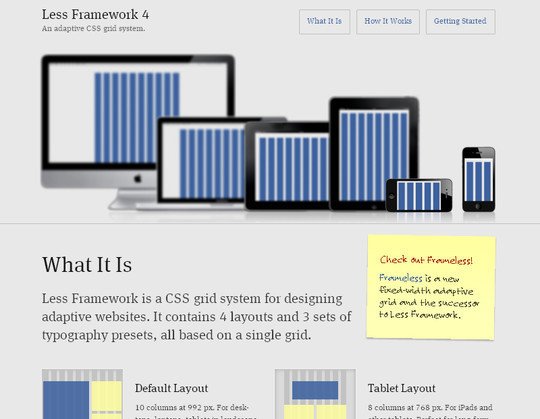
Less Framework is a CSS grid system for designing adaptive websites. It contains 4 layouts and 3 sets of typography presets, all based on a single grid.
Other CSS frameworks try to do everything—grid system, style reset, basic typography, form styles. But complex systems are, well, complex. Looking for a simple, lightweight approach that doesn’t require a PhD? Meet The 1KB CSS Grid.

Sleek, intuitive, and powerful front-end framework for faster and easier web development.

A cross-browser CSS grid framework that doesn’t hide pixels in margins!

The variable grid system is a quick way to generate an underlying CSS grid for your site. The CSS generated file is based on the 960 Grid System.

A dynamic layout plugin for jQuery The flip-side of CSS floats.

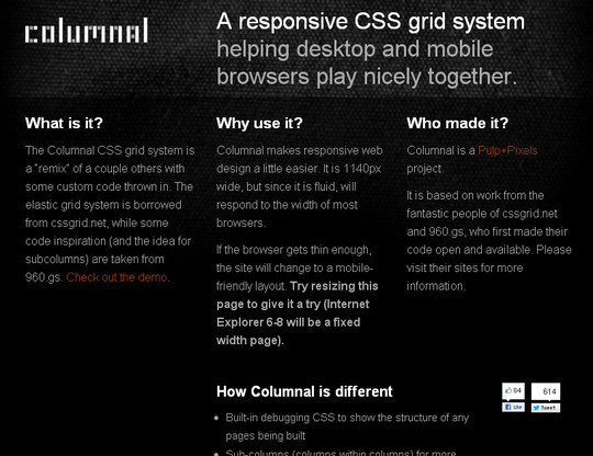
A responsive CSS grid system helping desktop and mobile browsers play nicely together.
The 1140 grid fits perfectly into a 1280 monitor. On smaller monitors it becomes fluid and adapts to the width of the browser.

320 and Up is a lightweight, easy to use and content first responsive web design boilerplate.

Templates for Rapid Interactive Prototyping.

Modernizr is a JavaScript library that detects HTML5 and CSS3 features in the user’s browser.

wmuSlider, a jQuery responsive slider.

Responsive jQuery Slideshow This example makes it possible to have fluid jQuery slideshow which scales responsively. This is the same method which is used on the new kiskolabs.com.

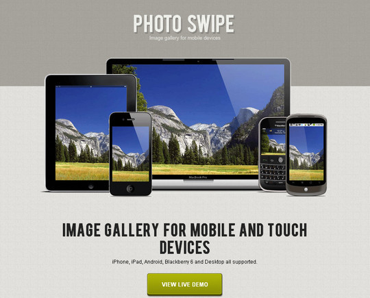
Image Gallery for mobile and touch devices.
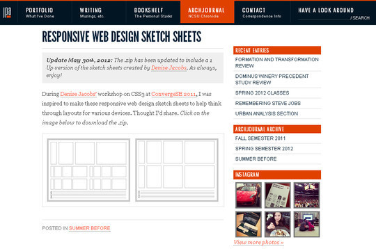
Responsive Web Design SketchSheets
Jeremy Patrick Alford’s personal site, with portfolio of graphic design, web design, drawing, writing and book list.
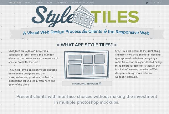
A Style Tile is a design deliverable consisting of fonts, colors and interface elements that communicates the evolution of a visual brand for the web. Learn how to use them here.
TinyNav.js is a tiny jQuery plugin (443 bytes minified and gzipped) that converts ul and ol navigations to a select dropdowns for small screen. It also automatically selects the current page and adds selected=”selected” for that item.

Enter the url to your site – local or online: both work – and use the controls to adjust the width and height of your viewport to find exact breakpoint widths in pixels. Then use that information in your media queries to create a responsive design.

Test any website at a multitude of common screen resolutions, including desktop monitors, tablets, and smaller mobile devices.

A lightweight, easy-to-use jQuery plugin for fluid width video embeds.

Screenqueri.es is a Pixel Perfect Tool to test your Responsive Design / Media Queries. Select from Pre-defined Screen Resolutions OR Drag Screen Handles To Go With Your Custom Screen Resolutions.

Just a simple calculator to help turn your PSD pixel perfection into the start of your responsive website.

Categorizr – A modern device detection script
Categorizr is a modern device detection script that helps categorize different web capable devices into 4 categories, desktop, tv, tablet, or mobile. It take’s traditional device detection and flips it on it’s end, assuming devices are mobile first, unless otherwise detected as tablet or desktop. Categorizr was created by Brett Jankord and is based on an my earlier device detection script.

Automatically serve high-res images, to those who’ll appreciate them.

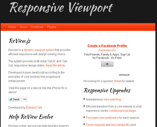
ReView is a dynamic viewport system that provides efficient responsive web design viewing choice.
The Responsinator is designed to test responsive websites on different device resolutions.
ResponsiveSlides.js is a tiny jQuery plugin that creates a responsive slider using list items inside ul. It works with wide range of browsers including all IE versions from IE6 and up. It also adds css max-width support for IE6 and other browsers that don’t natively support it. Only dependency is jQuery (1.6 and up supported) and that all the images are same size.

Responsive jQuery Slider Plugin Flexslider
An awesome, fully responsive jQuery slider toolkit.

WebPutty is a simple CSS editing and hosting service.

A simple, useful and beautiful browser window resize app for Web designers and developers.

One-click PX/EM/%/PT conversion tables, a custom conversion calculator, gnd generated reset CSS.

Responsive child theme for default Twenty Ten. Provides fluid layout for many browsers including mobile support for iPhone, iPad and Android. Being a child theme, it is dependent on the Twenty Ten theme as a parent.

BluCSS is a CSS framework designed with ease of use and simplicity in mind. It is specifically made so that when you’re working on your next project, you don’t have to worry about the essentials. With BluCSS, you can be up and running in less than a minute.
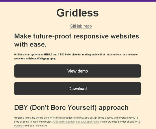
Gridless is an optionated HTML5 and CSS3 boilerplate for making mobile first responsive, cross-browser websites with beautiful typography.
Mobile Boilerplate helps you create rich, performant, and modern mobile web apps. Kick-start your project with dozens of mobile optimizations and helpers.

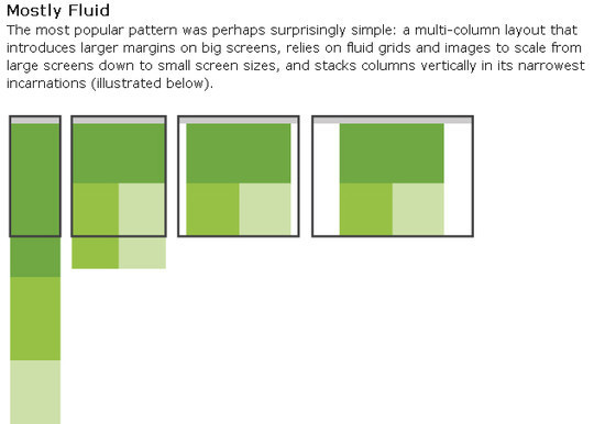
Through fluid grids and media query adjustments, responsive design enables Web page layouts to adapt to a variety of screen sizes.
Adapt.js is a lightweight (848 bytes minified) JavaScript file that determines which CSS file to load before the browser renders a page. If the browser tilts or resizes, Adapt.js simply checks its width, and serves only the CSS that is needed, when it is needed.

Convert a Menu to a Dropdown for Small Screens
The Five Simple Steps website has a responsive design with a neat feature. When the browser window is narrow, the menu in the upper right converts from a regular row of links into a dropdown menu.

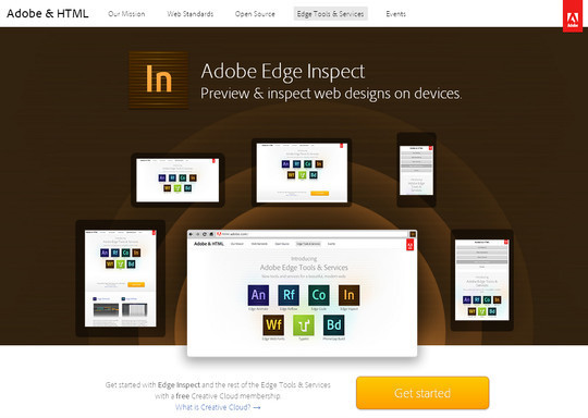
Adobe Edge Inspect is a workflow and preview tool for testing and simulating across multiple mobile web browsers.
via Free and Useful Online Resources for Designers and Developers http://feedproxy.google.com/~r/SmashingApps/~3/lMXXuGrEPkg/45-handy-responsive-web-design-toolbox.html